The Little Mermaid's Color-Grading Shipwreck
Inside the witchcraft that makes all movies look the same
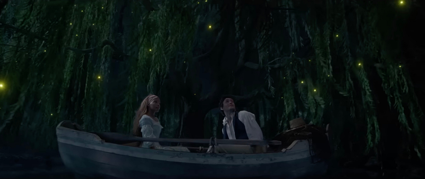
Newly-released stills from The Little Mermaid live-action reboot have drawn virtually unanimous criticism for their drab, putty-colored appearance. Who’s the villain behind this very un-Disney-like crayon box? The largely unknown and generally misunderstood process of color grading is the obvious culprit, but lurking behind the scenes are the Hollywood executives who steal creative freedom from filmmakers.
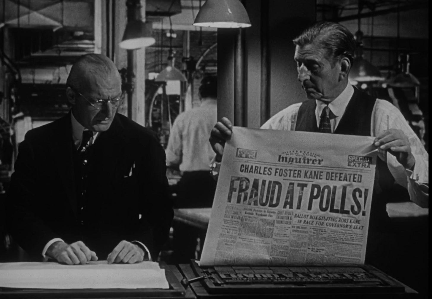
In the early days of film, there was no color, so there was no need for color grading. Cinematographers like Greg Toland (Citizen Kane) and Joseph Ruttenberg (winner of four Academy Awards for cinematography) were masters of their craft; as long as the black & white film they shot was processed properly, the resulting images were rich with tones, full of detail and depth.
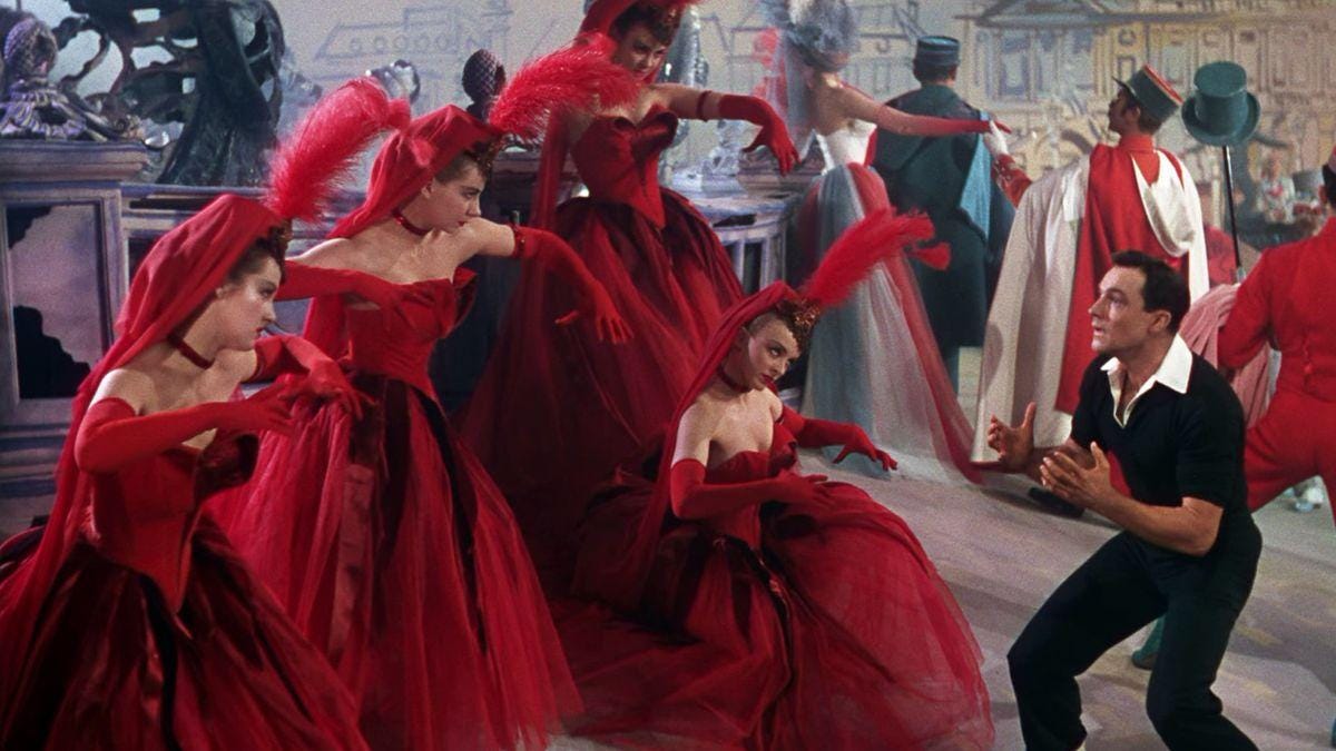
With the invention of Kodak’s three-strip Technicolor film in 1932, the need to make adjustments to the colors in a motion picture immediately became clear. Film responded differently to different light sources: daylight made things look blue, and interior lights made things look yellow. To make the final image appear natural and pleasing to the eye, those unnatural casts had to be removed. At first, this process was extremely laborious. Technicolor used three separate “inter-negatives” - separate strips of film (one for red, one for green, and one for blue) - which were individually processed and then combined into one full-color composite. Because this required colorists to vary the amount of time each inter-negative was exposed, the process was called “color timing.”
Movie technology became more sophisticated over time. Technicolor went the way of the dodo, and as cinema film stocks became more robust, the machines used for color timing became capable of more sophisticated manipulation. In the early 1990s, the editing process started to become computerized, but the early systems were just intended to replace the laborious process of cutting and splicing film; color timing was still done on film, in dedicated labs.
All that started to change in the mid 1990s. More powerful software let Hollywood colorists easily adjust not only the overall color in a scene, but individual colors. Although industry insiders continued to use the term “timing,” the British term “grading” gradually took over, as a shorthand way to differentiate the new, digital techniques from the old, analog ones.

Initially, filmmakers and cinematographers embraced color grading as a way to emphasize the mood of a scene, and to make their projects look distinctive. Color choice had always been an important part of production design (the aspect of filmmaking that deals with sets, wardrobe, props, etc.), but now reality itself could be altered to suit a filmmaker’s taste. A pale blue sky could be dialed up to a cheerful, bright cerulean for a romantic comedy, or turned down to a foreboding, gunmetal grey for a horror movie.
For a few years, filmmakers experimented happily with the opportunities afforded by digital color grading. If you look at movies from the late ’90s and early 2000s, you’ll notice that they generally look quite different from each other. David Fincher - now semi-notorious for his digitally-exaggerated use of bleak and monochromatic color - was one of the first directors to recognize the potential of this new technology, and his 1995 thriller Se7en, caused a bit of a stir for using color grading in a noticeable way.
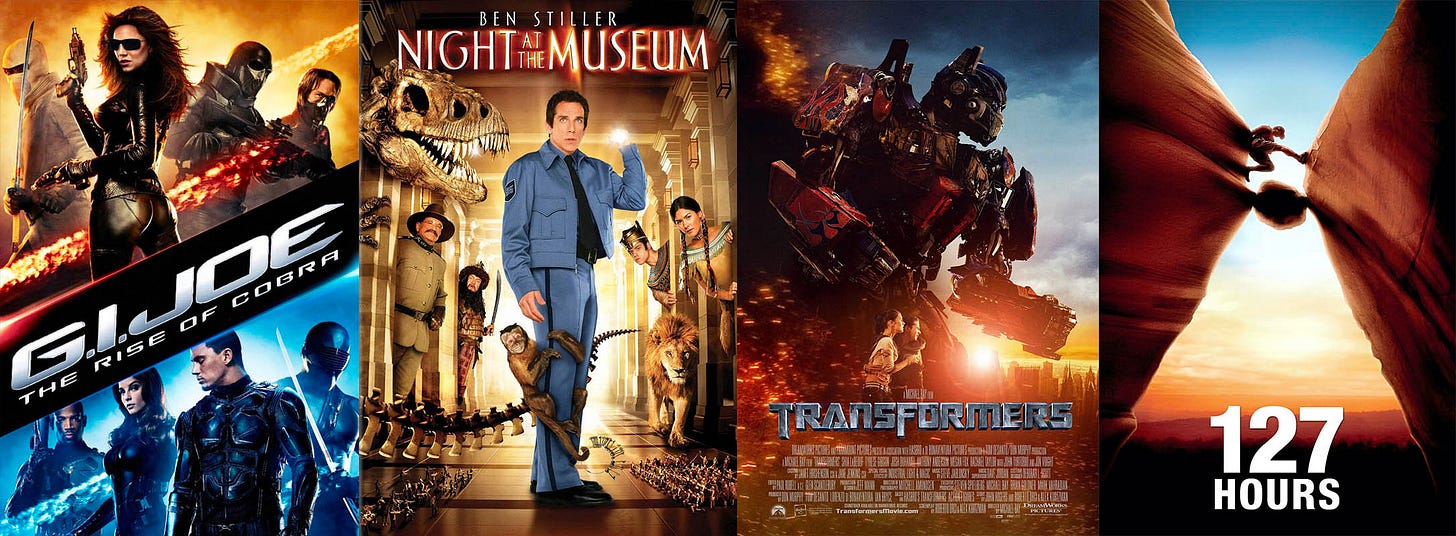
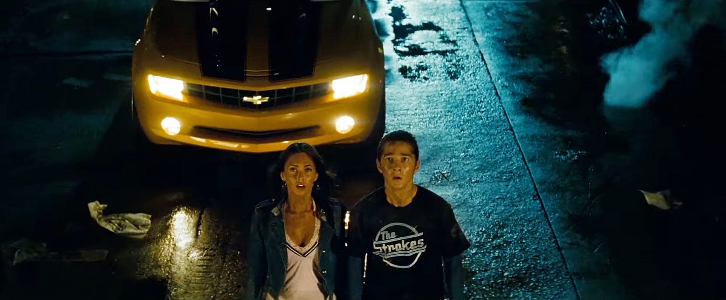
Then, Hollywood did what Hollywood does best: it homogenized. Studio bean-counters looked at the color grading of the most profitable films, and pressured editors and colorists to do the same thing to everything. In film circles, this is known as the “teal and orange” era.
The theory is simple: teal and orange are complementary colors - that is, they are opposite each other on the color wheel. When complementary colors are juxtaposed, our eyes perceive a strong contrast. If you’re marketing a movie, you want it to be as eye-catching as possible, and color contrast is a reliable crutch to lean on.
Of course, when everyone does the same thing, it stops being effective. Which brings us to The Little Mermaid, and its ill-advised tonal palette. After 15 years of visually assaulting audiences with bright orange skin and Smurf-blue backgrounds, Hollywood decided that filmmakers should mix it up a little bit. Of course, in La-La Land, this means “everyone suddenly change to the new thing.” The new thing, in color grading, was the opposite extreme: Fincher-esque, dark, desaturated colors.
Just as every movie, regardless of theme, had been shoe-horned into a teal and orange color scheme, every movie now is restricted to a dingy, limited palette that looks a bit like the actual colors were left outside to be bleached by the sun, and are now being viewed through a moldy shower curtain. Audiences, understandably, are confused. They know they don’t like what they’re seeing, but they’re not exactly sure why it looks that way.
The answer, in a word, is the Hollywood machine. Don’t fault the filmmakers or the production designers - if you walked onto the set of The Little Mermaid, the actual sets, costumes, and lighting probably looked amazing. You can’t even blame the editors and colorists: their hands are tied. It’s the studio executives - cowardly leeches with zero regard for either the art of filmmaking or the sensibilities of audiences - who bear the blame for ruining the magic of cinema.
Incidentally, this problem is bigger than color grading. In all likelihood, The Little Mermaid will probably have none of the charm or originality of the original animated feature. It will be just another very well-made but utterly soulless and synthetic product from the Hollywood factory, of which Disney is the foremost exemplar.
The issue is this: it isn’t just the look of movies that is dictated by market-trend-obsessed studio executives, it’s everything. The scripts, the topics, the dialogue, the cast - every bit of every studio picture (including those made by companies like Netflix and HBO) is now the result of research, polling, and ideological screening that squeezes out every drop of originality, and smothers the faintest whiff of anything that might be construed as problematic.
Viewed in this way, the ubiquitous, desaturated palette of modern films makes perfect sense. If Hollywood is going to drain all the magic and creativity out of movies, it may as well drain the color. Given the public’s reluctance to be part of Ariel’s gloomy new world, the studio executives might scramble to crank up the chroma, but, like Ursula the sea witch, they are unlikely to voluntarily give filmmakers back their voice.





Mebbe so, but ta me there is ONLY one Star Trek (no lens flares either!) and it had quite the look (clean, crisp, steady camera like steady-Kirk! camera rocked only when they were under attack!, an' no ugly flares, lightin' flatterin' to the actors, sets! etc) I stick by the original series' polly-ticks too, which in retrospect was kinda like Libertarianism in Space (I don't side now-a-daze w/ any pahrty but just sayin'); it wuz very Free ta be U n' Me separate but equal, weapons ONLY in face've threats, non-interventionist yadayada cuz later in-tar-nations mucked it up a bit an' not in a good way imo (however well told )... THIS was the look! https://tinyurl.com/bdcubn8w
Gosh yer on a roll Alex with yer new Stack, I'm so glad to check out yer writins'! This one too rings close ta home fer me too!
Bein' a fan of earlier "woiks" of cinema, I missed out on the whole post-90's palette "witchcraft" (more like wishcraft which in this case sounds even darker as the wishes of those in control wantin' to de-saturate our very LIVES are bein' fulfilled...) so I'm intrigued no end now learnin' this stuff. (An' yes, AGREED that all the other elements apart from the issue of color gradin' also have failing grades too today--mostly at least...)
Now, as ya know, manipulatin' audiences with all them "plastic elements" is a hallmark of all filmmakin' (GREAT filmmakin' too!) but to take away the "vision" of the story-tellers (de-saturatin' it) is not just creepy--it marks the more insidious manipulation of our LIVES, removing what is REAL (what the human eye can see! which video cannot replicate even in HD...) an' screenin' (in every sense;ve the word including filtering) what we are allowed ta see... It is a form of censorship... ya just don't "see" the cuttin'! Artistic choice and COLOR (so vital to us human beans) are removed from films by unseen hands but these same GRADERz seem to be in the driver's seat of everyday life in lockstep (!) with the (visual) dimming of our world--which is now poorer, less "nourishing" an' more arty-fish-all than ever!
Our skies are lit'rally dulled & dimmed (an' cross hatched with chemtrails), the food is more bland (an' fake), music is auto-tuned (an' faked), und so weiter... SO this-all goes hand'in VR glove...with a bigger agenda I'm SURE! (dang!)
My older daughter was OBSESSED with the life of Natalie Kamus an' her "color SCHEME" (scheme, think about that!) advisory fer Technicolor. Famously, Miz Kalmus BOTH helped many of "her" patented Technicolor films achieve the incredible "look" that WAS the lofty apex of the Golden Era of Hollywood film, AND got kicked off many a set fer "enforcin' " her patented-technology-related decisions over gen-u-ine ahrtistry (she was also an' often DEAD WRONG about the capabilities of the medium....) SO there were BATTLES cuz studios were contract-bound to keep her on as a paid consultant... it got ugly, it's quite a thing! Reads like a dimestore novel! (I think she an' Edith Head went at each other good more n' once over color choices, ha!) Anywayz, all this ta say that EVEN back in the day, an' mind ya I'm like the world's biggest Technicolor FAN!--there was STRIFE over color. But as ya said, EVERYONE was passionate about it from an ahrtistic (not ideological) angle... Just sayin' that this loooong pre-dates the 90's / video-assisted timing... Even them pesky stew-dio heads ('fore MBA dumbass movie-ignorant foolz started takin' over decision makin' an' it became all about bottom lines...) would support the "best" look of a movie -- with a passion! They may have had many demands but never would they want a film to look anything "less" that what it could be... so WOW today's scenario IS so very different.
One'a my longtime dear friends wuz fer decades a color timer at indie lab DuArt (in NYSee) an' I sawr first hand how this work WAS an ahrt! Selecting the filters to match the vision of director, cinematographer, art direction, etc. (by making shots match each other too!) was careful an' tedious work. My pal was steeped in film his'try an' knew the work of all the great filmmakers -- an' he wasn't an anomaly in this way. Color Timers (many older than my pal by far...) would all "speak" the language, know the references, an' appreciated (deeply) the craft. If ya said "shoot" we lost the light that day but kin' ya bring back a Jacques Demy "Umbrellas" look fer this scene--they'd know what ya meant! Daisy here wears many hats (wigs...costumes etc....) an' I worked with my ol' pal on quite a few lil' ol' projects've my own too. But my friend was a feller in demand and also worked with MANY known filmmakers so I can attest to the ahrtistic sensy-bilities and demands of HIS craft. When films were SHOT -- on celluloid 've course--an' LIT to evoke the desired palette an' mood anyway...he was just meeting the "visions" of the director n' production team.
In the 1990s as ya said, when it all went ta video timin' THREE things happened... (an' I say this without knowin' bout the "color gradin' shipwreck" that bow-sprit'd the heart of the in-dust-ry)...
1. DPs (cinematographers 'case yer readerz are unfamiliar) got LAZY (it became similar to the sound-related "fix it in the mix" sloppy atty-tude--an' up, sound recordist were also sufferin' from similar issues)--MANY of these LAZY DPs (I can't name names cuz these folks are still workin') started to RELY on the timer to FIX (their) major errors of sloppiness like poorly lit scenes (now grain could be somewhat reduced on the viddeyo releases if not on the prints...), inconsistently lit actors, their not bothering to filter properly (eg. daylight in the winda's) and SO much more... But Color Timers (even with new viddeo tech) were NOT CGI artists (that was develop'in) and could only do "so much" as a remedy, so as a result... FILMS started ta look like SH!T (sorry ta be crude but it's TRUE)
2. Faster film stocks made DPs even LAZIER--Kodak (what's now left've it!) dumped production of it's richer slower stocks (needin' more light and nearly demanding greater production values) so a whole ERA of lazy shooting became the NORM. Folks got used ta seein' poorly lit scenes (using ambient light NOT balanced for color temp--why botha? who cares is the audience needs ta SQUINT to see the actor's expressions...it's "cool"). Folks got used ta seein' "gritty" lookin' films (often poorly shot with outta focus bits, sunspots, crap that used ta be deemed cause fer a retake!). With layzee DPs just using grainy "fast" stock rather than having to properly light dark-skinned actors, audiences got used ta that look too... ugh.
3. Direct to video OR films that would be "mostly" seen on viddeyo. SURE, even with video-aided color timing there were indeed film prints made BUT the new focus (my pal complained've this..) was on timing FOR the video... EVEN on framin' for the video! (Like the screen ratio in the viewfinder of the camera literally PLANNED for it being mostly seen on video!)... Something that would look gawd-awful on the big screen could be made to seem "fine" on the little one so many films suffered by focusin' on the end-result that their works would be shown mostly on viddeyo... blech!
All the above contributed to the "virtual" visual dumpster fire that film has become today, at least compared to pre-1980s films. ALL the tech in the world cannot fix what ain't there--EVEN if budget permits the "experts" to attempt detailed repairs...but more importantly, we humans were GROOMED to accept and to expect "less" so after all that groomin'--they were ready for meaningless orange n' blue palettes (ha! NY's colors too!) an' the newer more dour, sad, tone-deaf colors of dust (cuz the globalists wanna make the human experience just that... DUST).
I wonder what push-back'll happen? In the meantime, I'm blessin' Martin Scorsese fer usin' high tech WITH a mind for intended color choices ta RESTORE the saturation and beauty of the ol' classics.
NOW if they'd just start strikin' 35mm prints again of the OLD films (when they were tee-riffic) an' would kindly fire up the actual film projectors we'd be in bizness!
Thanks fer the deep dive inta color gradin'--I knew the viddyo tech had started the downfall but boy golly they've reached rock bottom with this 'un
ps (just a factual note) Kodak didn't make Technicolor--Technicolor was not only it's OWN filmstock, OWN patented set of cameras AND films, but ALSO a LAB! (it' was like a monopoly on the process). You couldn't even develop or print the footage without Technicolor patented chemicals. Technicolor labs long outlasted their "era" and they eventually went on to (ironically) process Kodak movie film as well as Fuji (with a good rep at least in NYC!)